This is the first in a series of posts merging ideas from topology with current techniques of machine learning (such as deep generative models). Here we give an introduction to topology and discuss why it is a useful framework for data science. Subsequent posts will go into more technical detail and describe various applications.
What is topology?
Topology is the mathematical discipline that studies shape, with a fairly lenient notion of what it means for two shapes to be the “same.” To get a feeling for topology, it is useful to contrast it with its more familiar cousin, geometry. In geometry, two shapes are considered the same up to rigid motion: picking up a triangle and rotating or moving it to a different location does not change its shape.

Topology is more flexible, however, and considers the shape to be unchanged by operations such as stretching. Now notions like distance do not make sense (in that they are not preserved by topological operations), but higher level notions, such as what the dimension of a shape is or how many disjoint pieces or holes it has, are topological concepts.

Manifolds
One of the most fundamental and widely studied classes of topological spaces are manifolds, which are shapes that locally look like flat Euclidean space. For example a torus (e.g. the surface of a donut) and a sphere (e.g. the surface of the earth) are two-dimensional manifolds — by zooming in enough near any point, the shape looks just like a plane.
Such a local identification with Euclidean space is called a chart and a collection of charts such that every point is contained in at least one of them is called an atlas. How the local, simple charts of an atlas patch together determines the global topological structure of the manifold.
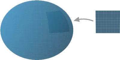
In other words, manifolds are locally boring but globally interesting.
Topology as a framework for data science.
Topology is one of the most widely studied branches of mathematics and permeates across nearly all other areas of mathematics. It has also found tremendous use in physics, forming the foundations of theories such as Einstein’s general relativity and string theory. However, unlike calculus or linear algebra, it is has yet to find widespread use in other quantitative disciplines.
We argue that the flexibility of topology makes it an appealing framework for data science and highlight four points that demonstrate the usefulness of taking a topological perspective of data. The paper Topology and Data , which is a great overview of the related topic of topological data analysis , has a similar discussion.
1. Many questions we ask about data are topological.
A common task of unsupervised learning is to cluster a dataset into natural disjoint subsets. This is asking a topological question, namely how many “connected components” a space has. The other big task of unsupervised learning is dimensionality reduction: our data usually comes as a small subset of a very large dimensional Euclidean space and we hope to discover the intrinsic, smaller dimensional space forming our dataset.
For example, the MNIST dataset (which is small by modern standards) consists of 28x28 pixel grayscale images and therefore has data lying naturally inside of a 784-dimensional Euclidean space. Digits will only make up a very small portion of all possible gray scale images and we wish to identify this smaller dimensional subspace. Most dimensionality reduction algorithms attempt to do this by finding a suitable map from the 784-dimensional ambient space to a lower dimensional Euclidean space. We will see a more topologically informed method of doing this that involves a collection of maps instead of a single one.
Topological notions are also implicit in supervised learning. In this type of learning, the goal is usually to find a function that acts as a soft classifier or a regressor. Small variations in the input should give rise to small variations in the output, which is formalized in the topological notion of continuity.
2. Common preprocessing transformations preserve topology but not geometry.
In data science, we almost always preprocess the data before putting it into a model. For example data is often scaled, and there are many ways to do this: we can subtract off the mean and divide by the standard deviation, or we can use the minimum and maximum values to scale each component of the data to lie in some fixed interval, such as [0,1]. Similarly, PCA is often applied as a preprocessing step, which has the effect of decorrelating the different features. All of these operations change the geometry of the data (they distort distances) but do not change the topology of the data.
3. If the manifold hypothesis is true, then we can get away with a lot of linearity.
The manifold hypothesis says that most of the real world data we deal with lie on a submanifold of the ambient (usually much higher dimensional) feature space. In machine learning there is a tradeoff between linear models and more complicated models (neural networks, boosted decision trees, etc.), with the former being faster and often more interpretable while the latter is more accurate but also more opaque. By using the local linearity of manifolds, we can hope to capture some of the best of both worlds.
4. Nice visualizations and compact representations of data.
Real world data is usually hard to visualize since it is both wide (lives in a large dimensional ambient space) and long (has a lot of datapoints). There are many constructions in topology that enable us to visualize or summarize high-dimensional spaces. One such is called the Čech nerve and can be associated with an atlas of a manifold. A piece of the resulting combinatorial object is a graph (in the sense of nodes and edges) that keeps track of how the different charts of the atlas overlap. This graph provides a useful, compact visualization of a dataset.
Examples
Nested circles
Let’s make things concrete and look at an explicit toy example. Suppose we have the dataset below, consisting of (slightly noisy) data sampled from two nested circles.
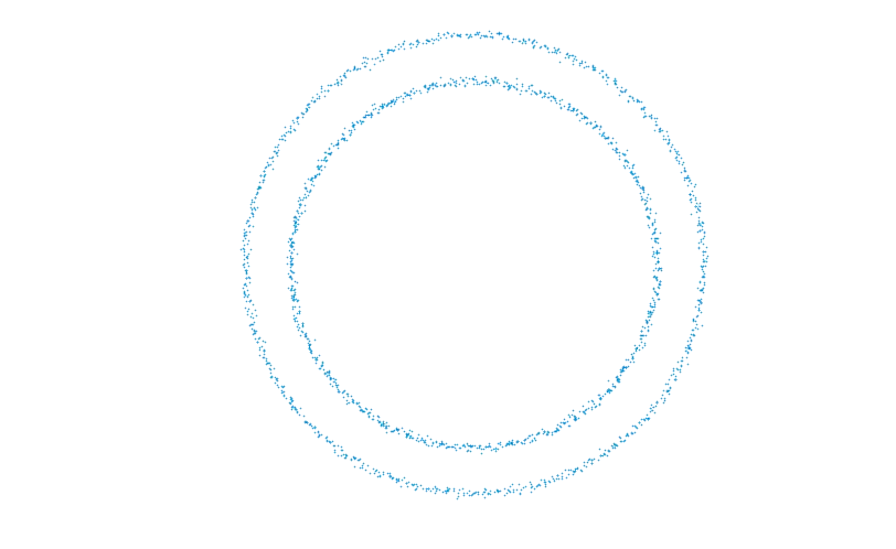
For this dataset, a desirable unsupervised learning algorithm would do two things:
- Reduce the dimension to one, which is the intrinsic dimension of the space the data is sampled from.
- Separate the inner and outer circles from each other.
The majority of dimensionality reduction algorithms seek to find a single map from the plane to the real line that loses the least amount of information on the dataset. Such a method will not be able to capture the topology of even a single circle. Further, nor can a single linear model separate the two circles. However, by taking a topological perspective, instead of looking for a single map we should look for a collection of maps that form an atlas.
Thus we try to imbue this dataset with the structure of a manifold, consisting of a collection of (possibly overlapping) charts, each of which serves to identify the corresponding region with a line segment. We fit such a model using six charts and where each of the maps is the restriction of a linear map from the ambient plane to the real line. Associated to each point is a list of probabilities weighing which of the six linear maps should be used for this particular point. Coloring each point by the chart giving the maximum probability yields the picture below.
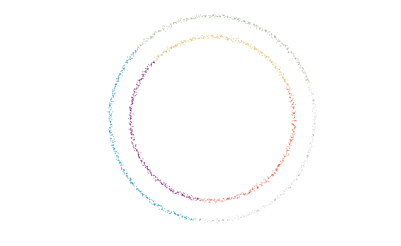
Each colored region is mapped linearly to a line with losing minimal information, in that only close-by points in the chart map to close-by points on the line. Together these maps fulfill point 1. above.
We can use a count of the points that have a sufficiently high non-zero probability of belonging to two different charts as being a measure of the overlap of those two charts. This gives us the patching information necessary to reconstruct the manifold from these six simple pieces. In this case the Čech nerve becomes a graph, with one node for each chart and an edge between two nodes if the corresponding charts overlap.
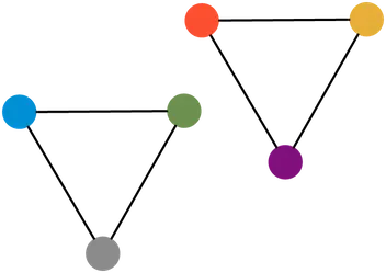
The disconnectedness of this graph means that we were able to separate the two circles, fulfilling criterion 2. You may have even noticed that the graph itself is topologically equivalent to the original space of two disjoint circles. This is not a coincidence and always happens under certain favorable circumstances.
MNIST
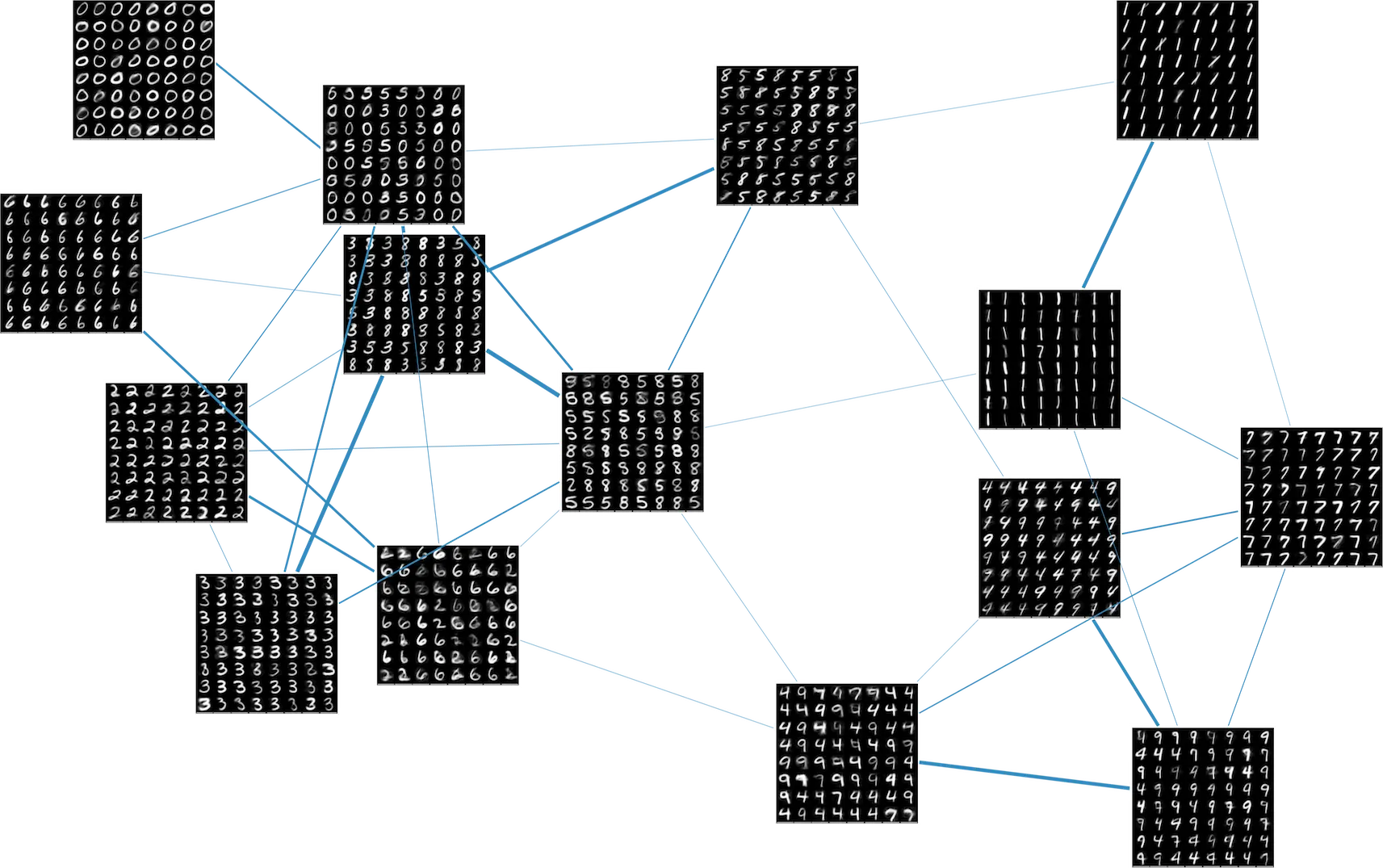
A good topological model of our data should have a generative aspect, meaning that we should be able to create synthetic data by sampling from the lower dimensional charts. As an example, we fit such a generative, two-dimensional manifold structure to the MNIST dataset.
This results in a collection of fifteen different maps from a rectangle into the ambient 784-dimensional space in which MNIST resides, as well as a measure of the amount of overlap between the charts. We can get a nice visualization of the Čech construction by breaking each rectangular chart into an even grid and generating images from each grid point. The chart membership probabilities give a measure of how much two charts overlap, and we use this number to weigh the edges of the graph. This results in the visualization below. Note that different digits tend to cluster into different charts and edges form between charts that contain similar looking digits.
For the technical details of how the manifold structures for these examples were fit, please see the preprint and the follow-up blog post.
Hopefully this post convinced you that topology can serve as a useful framework for understanding data. In the next posts we’ll look into ways of adding topological structure to various representation learning algorithms.